Color accuracy printing is one of the most critical elements of premium packaging. For global brands, packaging color consistency directly affects brand recognition, shelf impact, and perceived quality. Whether using CMYK packaging printing or Pantone packaging systems, accurate color matching ensures that your product looks the same in every market.
Why Color Accuracy Matters in Packaging
Packaging is often the first physical touchpoint between a brand and its customer. Even slight color variations can:
- Reduce brand trust and recognition
- Create inconsistencies across product lines
- Cause rejection by retail partners
- Increase reprint and quality control costs
Brand Reality: Human eyes can detect color differences as small as ΔE 2–3, making color control essential in packaging production.
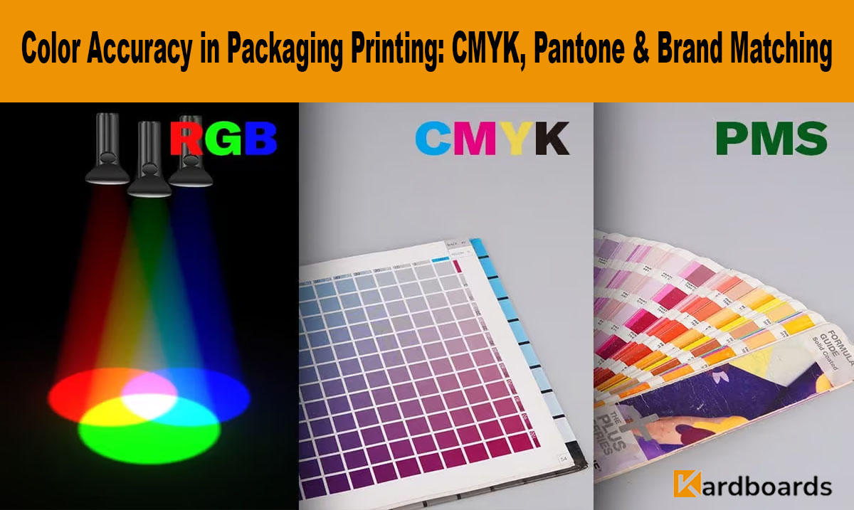
Understanding CMYK Packaging Printing
CMYK packaging printing uses four process colors—Cyan, Magenta, Yellow, and Black—to create a wide color range. It is the most common method for offset and digital packaging printing.
- Cost-effective for large-volume production
- Ideal for full-color graphics and imagery
- Works well on paperboard and corrugated materials
- Color results depend heavily on calibration and material
Because CMYK colors are mixed during printing, exact color replication can vary across presses, substrates, and locations.
Pantone Packaging: Spot Color Precision
Pantone packaging relies on pre-mixed spot inks from the Pantone Matching System (PMS), allowing for highly precise and repeatable colors.
- Ideal for brand logos and signature colors
- Greater consistency across production runs
- Preferred for luxury and premium packaging
- Higher cost compared to CMYK printing
Luxury Insight: Premium brands often combine Pantone spot colors with CMYK printing for both accuracy and visual richness.
CMYK vs Pantone: Which Is Right for Your Brand?
Choosing between CMYK and Pantone depends on brand requirements:
- CMYK: Best for photographic designs and cost-sensitive projects
- Pantone: Best for strict brand color matching
- Hybrid Printing: Combines CMYK images with Pantone logos
Challenges in Brand Color Matching
Achieving consistent color accuracy printing across global supply chains involves several challenges:
- Different paper textures and coatings
- Ink absorption variations
- Lighting conditions during inspection
- Machine calibration differences
How Professional Manufacturers Control Color Accuracy
Leading packaging manufacturers implement strict color management systems:
- ICC color profiles for each press and substrate
- Digital color proofing before mass production
- Spectrophotometer-based color measurement
- ΔE tolerance control for brand approval
Quality Standard: Premium packaging typically maintains ΔE ≤ 3 for brand-critical colors.
Color Accuracy for International Brands
For brands sourcing packaging internationally, color consistency is even more important:
- Ensures uniform brand presentation across markets
- Reduces risk of rejected shipments
- Maintains compliance with retail guidelines
- Supports long-term brand equity
How Kardboards Ensures Perfect Color Matching
Kardboards supports global brands with advanced color accuracy printing through:
- Pantone-certified color matching workflows
- CMYK press calibration and profiling
- Pre-production color proofs and samples
- Consistent quality control across all runs
Frequently Asked Questions
What is color accuracy printing?
It refers to reproducing colors in packaging that closely match the approved brand reference.
Is Pantone better than CMYK for packaging?
Pantone offers better consistency for brand colors, while CMYK is more economical for full-color designs.
Can CMYK match Pantone colors?
CMYK can approximate Pantone colors but may not achieve exact matches.
Why do colors look different on different materials?
Paper texture, coating, and ink absorption affect final color appearance.
How can brands avoid color inconsistencies?
By using professional proofs, Pantone references, and working with experienced packaging manufacturers.